
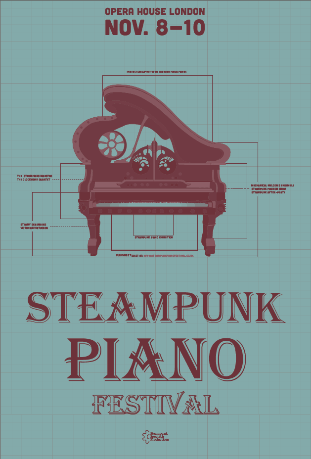
The main poster — anchoring the festival's identity in historical illustration and archival teal.
Overview
A fusion of
historical eras
Most event branding relies on theatrical clichés, but the Steampunk Piano Festival required an identity that felt genuinely anchored in Victorian industrial reality. This project bridges the formal, classical world of piano performance with the gritty, imaginative aesthetic of steampunk subculture at the Opera House London.
The challenge was to create a visual system that respected both the prestige of a classical concert venue and the raw, mechanical energy of steampunk culture — without resorting to surface-level ornament.
The solution was to root everything in Victorian engineering logic — treating the festival's visual language as if it were drawn from actual blueprints and industrial archives rather than fictional clichés.
The Problem
The theatrical
cliché
Existing steampunk designs often rely on surface-level ornaments — gears and rivets — that lack functional logic. For a prestigious venue like the Opera House, these tropes felt too informal and lacked the "archival weight" necessary to communicate high-caliber musical performance.
The design brief
Create an event identity that feels both historically grounded and contemporary — one that can speak to classical music audiences while capturing the imagination of a broader cultural crowd.
Outdoor Application
Testing the palette
in context
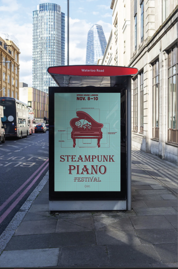
Outdoor application: testing the Archival Teal palette in a modern urban context.
The identity needed to work at scale — from printed posters to outdoor advertising. The Waterloo Road billboard tests how the blueprint aesthetic translates to public space, maintaining legibility and impact.
Visual Identity
Archival weight over
decorative noise

Brand ecosystem — colour palette, typography, and design system.
The identity is anchored by a curated typographic system. Algerian provides the ornate Victorian headers, while Cubano adds industrial grounding. The colour palette moves away from typical steampunk bronze toward an Archival Teal that evokes historical blueprints.
Archival Teal
Victorian Red
Period Brown
Paper White
Merchandise
From print
to product

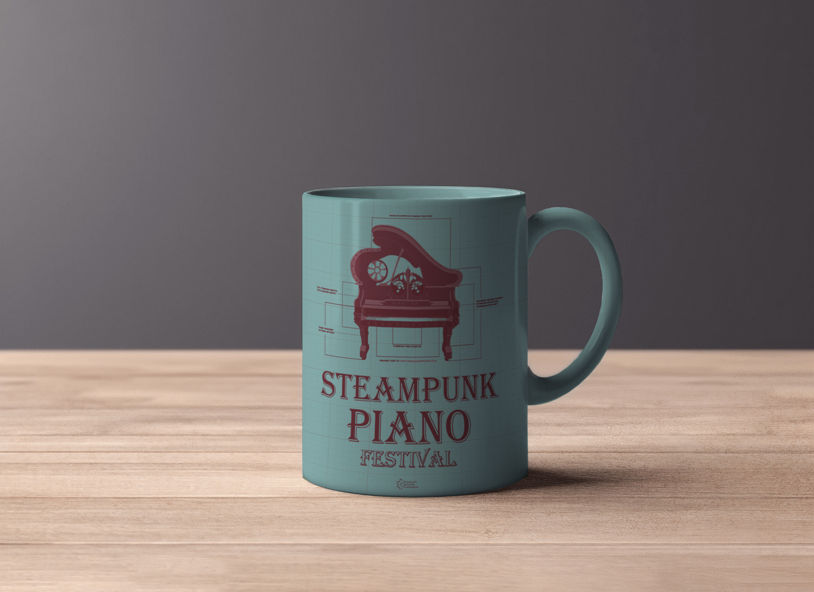
Branded merchandise — the blueprint motif works across different materials and scales.
The identity extends naturally to merchandise. The blueprint motif maintains its technical precision whether printed on fabric, ceramic, or metal — proving the flexibility of the visual system.
Apparel
Wearable
precision
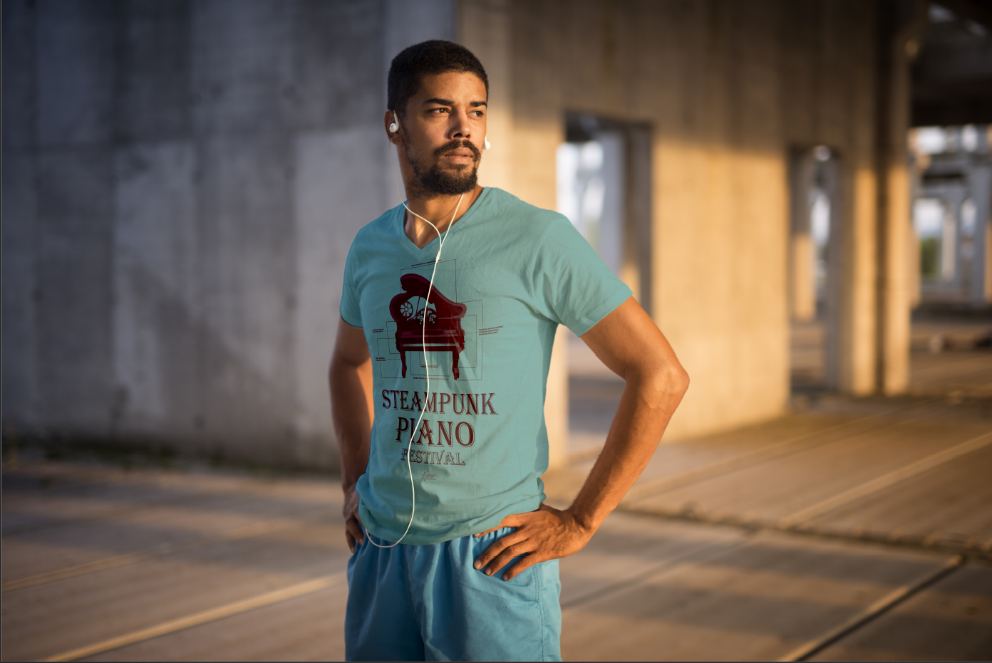
Brand extension: the blueprint aesthetic applied to apparel.
The t-shirt applies the same technical illustration approach to a wearable format. The design maintains its architectural quality while becoming a statement piece for festival-goers.
Digital Presence
Frictionless
ticketing
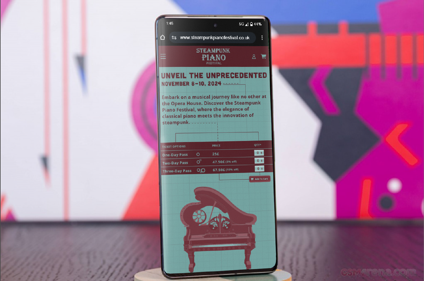
The mobile experience translates mechanical complexity into a clear purchase path.
Translating the identity into a digital product meant simplifying without losing character. The ticketing interface applies the typographic system and teal palette to a minimal layout — ensuring the visual richness of the print identity doesn't overwhelm functionality.
Mechanical complexity on the poster; effortless clarity in the purchase flow.
Conclusion
Supporting the
imagination
By reframing steampunk as a serious study of Victorian engineering, the branding aligns with the prestige of the Opera House.
It demonstrates that event systems should support the imagination of the audience while respecting the historical context of the place they inhabit. The result is an identity that feels earned — not costumed.